So, you can see my website has a new look! I really hope you like it. We’re still getting the kinks out, so excuse any weirdness. The wallpaper is based on late-19th century styles.
Didn’t website artist Laird Sapir do a terrific job? I’ll be adding more pages of cool historical info in the weeks ahead, but what’s here should keep you busy for a little while. 😉
On to Art Nouveau as inspiration. What sort of inspiration? I’m so glad you asked!

By now, many of you know that I’m in the process of publishing my first book in a planned historical mystery series. In case you missed it, here’s the post where I talk about it: Reflecting Back, Moving Forward, and Spatchcocking.
One of the biggest steps in the process is hiring an artist for the cover. I know that many self-pubbed writers skip this and do it themselves; sadly, I was never very good at art.
After finding the right person (whom you can afford), the next challenge is coming up with a concept for the cover.
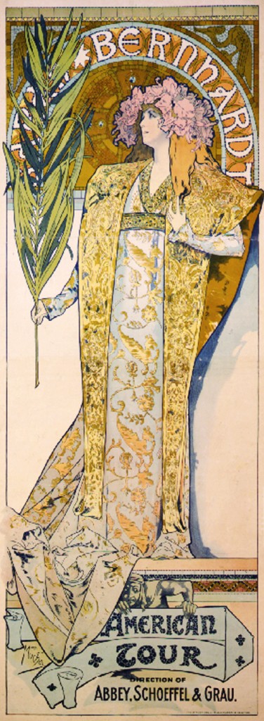
So I went back to the art of the 1890s, the time period of my novel, and I found inspiration a-plenty! The image at left is an 1896 poster that advertises the upcoming American tour of actress Sarah Bernhardt. It was done by Alfons Mucha, who did a great many posters and lithographs during this time.
A little bit about Art Nouveau:
Art Nouveau – or le style moderne, as it was known in France – is characterized by curves and flowing lines, with organic elements incorporated into the scene. In the Sarah Bernhardt poster, for example, you can see that she’s holding a palm and has a profusion of flowers in her hair. Many of the background patterns in art nouveau are abstract, with curves and curlicues. Some images have a “stained glass” look to them, such as this one:

So it’s not surprising that it was during this time that Tiffany & Co. also put out their iconic stained glass, in the form of windows and lampshades.

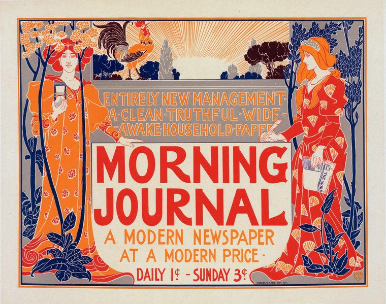
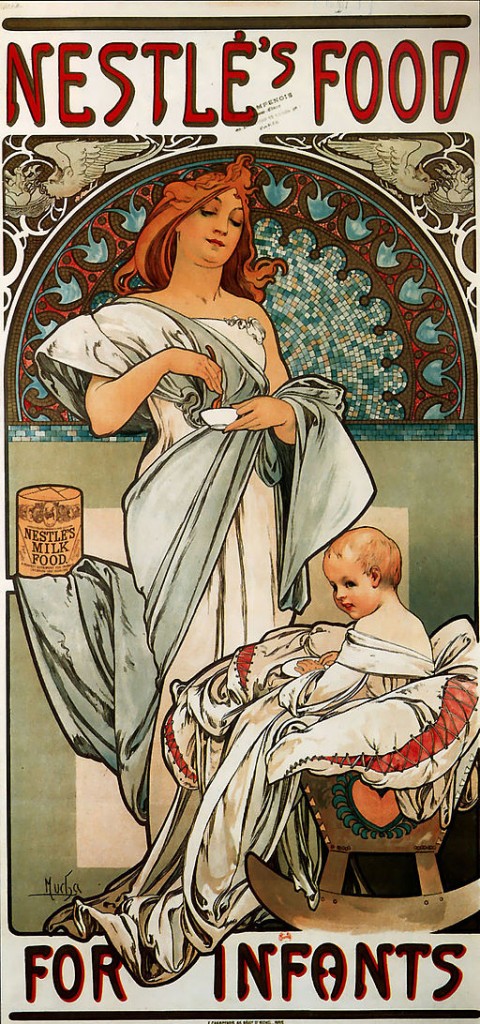
But Art Nouveau is not a uniform style: artist preference, country of origin, and how the particular piece would be employed (advertisement, magazine, artwork) were all factors that could create dramatic differences in the look. Here are a few more posters to give you an idea of the range:

And here’s an interesting 1897 ad for Nestle’s “Milk Food for Infants.” Looks like a goddess is feeding the baby, LOL.

Here’s another 1897 poster. I think it is advertising tea, but the entry didn’t specify.

For more info on the Art Nouveau movement, check out this Wikipedia article.
So now that you are familiar with Art Nouveau, you’ll be able to see how my artist, the super-talented Niki Smith, employed the style on my cover. Yep, you heard it right: the art for the front cover is done! I’ll have the big reveal on Friday.
What’s your favorite art style? I’d love to hear from you.
Until next time,
Kathy


Very nice, Kathy!!
Thanks, Tiffany!
Very interesting stuff as usual and your new website definitely fits with your entire brand.
My art style is western, and my western I mean cowboys, Native Americans, and anything with a southwest flair. The artist Tim Cox is one of my favorites. Don’t know what “style” you’d call that, but that’s what I like.
Patricia Rickrode
w/a Jansen Schmidt
I really appreciate that, Patricia! Western is a fab brand, so it’s great when the interest and the brand can dovetail, right? By the way, have you read any of the Walt Longmire mystery series, set in Wyoming? I’ve just started them, and they are terrific.
It looks great Kathy! 🙂
Thank you, Coleen! 😀
I love art nouveau, Kathy. It has such an elegant style and the look is simply timeless. And Laird did a wonderful job on your website. can’t wait to see your cover reveal on Friday!
Isn’t Laird amazing? And she continues to help me get the theme up and running. Super fab gal! Thanks so much for the visit!
Kathy – First, I love your new website! It’s beautiful to look at (and so is the Art Nouveau you shared). It’s also so very appropriate for your series, your theme, the whole thing. Nicely done!
Thanks, Margot! It took a long time, and a lot of thought, but it is worth it!
You know I love it! My period.
I really appreciate that, Yves! 😀
The site is beautiful!
Thanks, Pat! 😀
Kathy! I’m so excited for you! This is the way to pique readers’ interest! 😉
Renee, I so appreciate your support. Thank you! 🙂
Love the new look, Kathy! And I adore art nouveau. So chic! Can’t wait to see the cover.
Cool – I didn’t know that! Thanks so much for the support, Julie!
Found you via Renee Schuls-Jacobson above. The website is beautiful. You have my attention 🙂
Hi, K.M., so glad you found me through Renee. Isn’t she a darling peep? 🙂 I so appreciate your kind words!
Wow! Look at your gorgeous website now! It’s historical without being stuffy. So pretty! I love Art Nouveau, too! Beautiful fluidity.
Your branding seems to be going really well, Kathy. I love the historical pages! Oh, wish you tons of luck with the book and the website! Can’t wait to see the cover. I’m out of town on Friday but will catch up with you over the weekend.
Thanks so much, Marcia! Have a great trip, and catch ya later. 😀
“…so excuse any weirdness”
Always.
Interesting short intro to Art Nouveau. Flowing robes and lovely (but modest) women seemed to be staple subjects for the genre. I like the ads. Looks like the Nestle’s mom is mixing a little tea for baby.
The wiki article includes a last line segue into the next art craze: Art Deco (the best thing about watching Poirot, right after the music — speaking of mysteries)
Now I look forward to seeing the cover — something I hadn’t thought of before. Cool Idea. Must be fun for the artist to recreate and adapt a style and fun to see the results.
I’m hoping Niki had fun with it…I kept asking her to tweak things, but she’s a patient gal. I love the Poirot series, too! David Suchet is marvelous. Thanks for the visit, Bill!
Sorry I’ve been off the grid for a while, Kathy, but LOVE this new design. It’s so *you*! Art nouveau is one of my favorite periods/styles and I’m sure it will work wonderfully on your cover. Congrats!
Thanks, Debra! Laird Sapir has both the tech skill and the artistic eye, doesn’t she?
It’s such a beautiful site! Very excited to see the cover reveal on Friday!
You just missed this http://www.dm-art.org/View/PastExhibitions/dma_442782 and you would have loved it!
Jane, that looks like it was really interesting, although I don’t live anywhere near Dallas. Maybe the exhibit will come to my area. Thanks so much for stopping by! 😀